Smart group recommendations for Movies and tv shows
WatchBlend- a movie recommendation app for groups
This project was completed as part of Google’s UX Design course. I was responsible for conducting user research, developing wireframes, and building interactive prototypes. This case study highlights how I used UX design principles to create a solution that streamlines group movie selection.
The Problem
Andrew and his partner Caroline are busy young professionals who struggle to find the perfect movie for date night. They often waste valuable time scrolling through streaming platforms and debating options, leaving them frustrated and cutting into their time together. They need a smarter way to quickly agree on a movie that matches both of their tastes, so they can spend more time enjoying the experience rather than searching for it.
The Goal
The goal of our movie recommendation app is to simplify the decision-making process for groups by providing personalized recommendations that align with each member’s preferences. By streamlining movie selection, the app will enhance the streaming experience for indecisive users. Success will be measured by tracking the time it takes users to reach a group consensus on a movie and whether they enjoy the recommendations provided.
The Solution
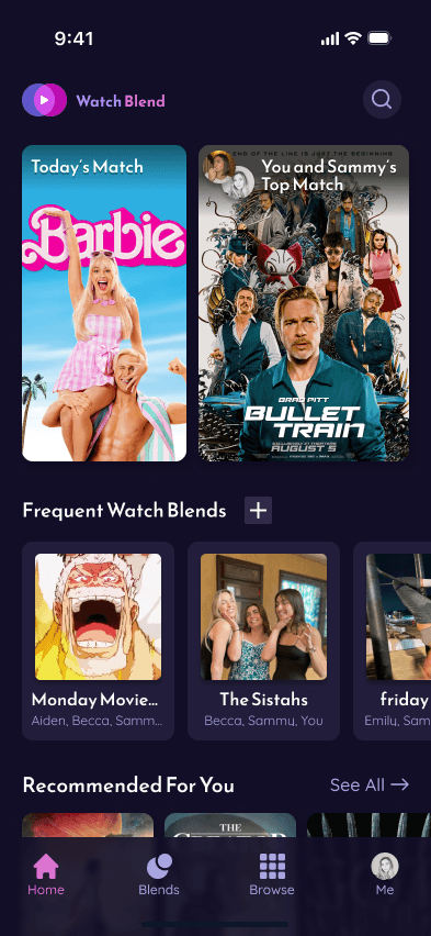
Our mobile app empowers users to easily find the perfect movie or show, whether watching alone or with friends. Users create an account and build their personal taste profiles by swiping through titles in a Tinder-style interface—adding movies to their watchlist, marking them as seen, and rating them. The more a user interacts, the better the app tailors future recommendations to their unique tastes. The standout feature are “Blends”, where users can invite friends to join a group and merge their preferences. This blended profile generates customized movie recommendations that reflect the tastes of everyone in the group, making it easier to find the ideal option for shared viewing experiences. With this intuitive app, users spend less time searching and more time watching.
Interact with Prototype
The first phase of this project was to empathize with our potential users and ask as many questions about their needs and wants as we could. Because this is an academic project, the research in this phase consisted of interviewing ChatGPT to collect mock interview data.
Determining Research Goals
Before starting initial research, it was important to define clear goals.
Here are 4 goals that I defined to guide my user interviews:
I want to identify the key factors, behaviors, and frustrations that influence movie or show selection, both individually and in groups.
I want to uncover pain points when users try to select content with others, including how disagreements are resolved and how much time is spent on debating.
I want to discover what type of information users look at when trying to decide what to watch in order to gain a better understanding of the features that should be included.
I want to gauge interest in a personalized recommendation solution, such as assessing users' comfort with linking the app to a friends.
User Interviews
With the aim to form a representative sample, I "interviewed" five people that could be considered target users for the product. I defined a target user as someone who regularly uses streaming platforms to watch movies and tv shows.
Some examples of interview questions were:
How do you usually decide what to watch when you’re by yourself?
What factors influence your decision the most (e.g., genre, mood, reviews)?
What frustrates you the most when trying to decide what to watch?
How often do you watch movies or shows with friends or a partner?
What challenges do you face when choosing for a group?
User Personas
One of the interviewees was a 27 year old named Andrew. Andrew is a busy marketing professional who needs to quickly and efficiently decide what movie to watch on date night, because he wants to spend more time enjoying his night than debating what to watch.
Uncovered Pain Points
Below are the top four pain points found from the five interviews:
Wasting Time Scrolling Without Making a Decision
Nearly everyone mentioned that they spend too much time browsing titles without making a decision, which reduces the enjoyment of watching.
Conflicting Preferences in Group Settings
This was a common frustration for couples and group watchers, as differing tastes lead to long debates and delays.
Decision Fatigue from Too Many Options
Users feel overwhelmed by endless options on streaming platforms, leading them to revert to familiar shows or abandon their search altogether.
Mood-Dependent Decision-Making Challenges
Several users mentioned that their choices are influenced by their mood, and streaming platforms don’t always offer sufficient filtering to match this.
To guide the ideation and design process, I crafted a product goal statement:
Our app helps groups combine their movie and show preferences to recommend the best title, simplifying decisions for indecisive streamers and watch parties. Success is measured by the time it takes to reach consensus and user satisfaction with recommendations.
Storyboarding
I drew out a big-picture storyboard to better visually describe a user's experience with the app.
User Flow
The user flow I decided to focus on was how a user would create a new group, or "blend", with their chosen friends to get the best recommendation.
Paper Wireframes
The goal of my paper wireframes was to quickly design as many options as I could. From these wireframes, I starred the elements that I liked the most and wanted to include in my digital wireframes.
Digital Wireframes and Low-Fidelity Prototype
Here, I refined my wireframes and created a low-fidelity prototype following the user flow I mapped out earlier.


It was important for me to get my design into the hands of users as early as possible in order to make sure I was headed in the right direction. I conducted two usability tests with real users and synthesized the research to make more informed design decisions.
UX Research Plan
My first step was to build my UX research plan. This included information about the project background, the research goals and questions, KPIs, methodology, the participants, and the script.
Usability Tests
I conducted two usability sessions using the low-fidelity prototype, however it would have been ideal to conduct the session with about 5 different users. One user was 25 years old, and the other being 54, both being avid streaming platform users.
Thematic Analysis and Findings
After taking extensive notes from the recorded sessions, I performed a thematic analysis to pinpoint the main takeaways and findings from the research. Below are some of the top themes found from this round of research.
Filtering, Sorting, and Searching Habits
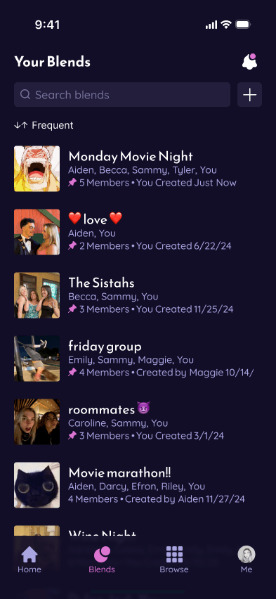
Users prefer to have their blends and friends list sorted by Most Frequent as the default, as opposed to Most Recent. Users also would search for specific blends by group member names.
Interest in COmpatibility breakdowns
Users wanted to see clearer visual breakdowns of why a title was recommended, as well as their compatibility with their friends.
Personal Watchlist prioritized
Users expressed a particular interest in accessing and managing their personal WatchList.
Confusion with blend customization options
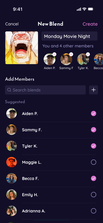
It wasn't as intuitive for users to change their blend's photo and name.
Using the data collected from usability tests, I refined my designs to create a high-fidelity prototype.
Hifi Prototype
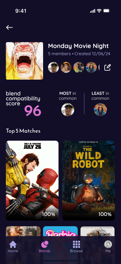
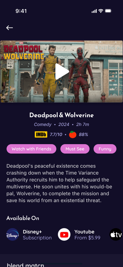
Focusing on the blend creation user flow, I designed 5 main screens that take the user through the blend creation process. After naming the group, setting the photo, and selecting members, users are taken to the Blend Detail screen where they are able to view the Top 5 recommendations.
Next Steps
Moving forward, I would like to design the user flows for how a user would interact with WatchBlend from a more individual standpoint. This includes how they would build their taste profile, add titles to their Watch List, and rate them.
